One thing that has been bothering me while trying to redesign my site is audience. Who is my site intended for? Future fans? Other writers? Agents and Publishers?
The Elements of Web Design
In designing a site, there are two things you need to consider: function and audience. We covered function in the last post, but here’s a recap since it’s been a while. The point/function of the site is to create an online presence that should be professional while also showing my personality as a writer. Ideally it will be something I can build off of once I am a published writer.
So what about audience? Since the main feature of my site right now is my blog, that would suggest that my main audience is other writers and maybe (one can hope) agents and publishers. But I don’t want to design a site that will become obsolete once I have something ready to submit and then ready to publish. So I would like to create a site that is also accessible to agents, publishers, and future fans.
Mock-ups: The Building Block of a Successful Design
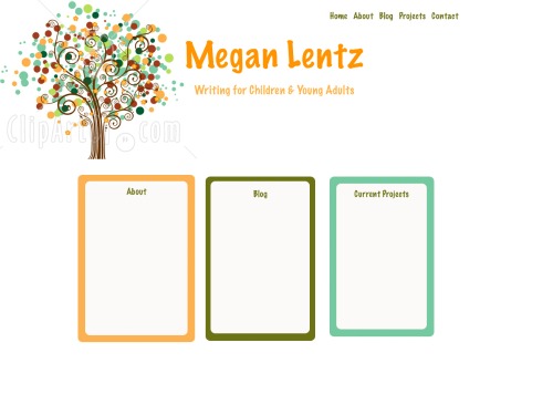
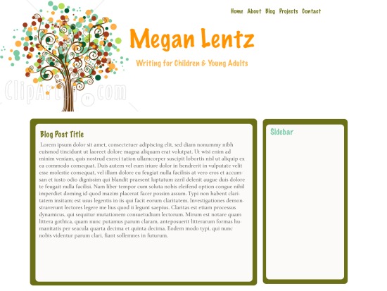
In thinking about the audience, I have come up with some mock-ups, or sample designs. To create these, I used Photoshop and made a sample web page. The purpose of a mock-up is to provide a sense of what the site would look like – how the colors and images and layout will all work together. Creating a mock-up saves time and gives you samples to run by other people. In this case, I decided to share my mock-ups with my current audience (yes, that would be you) and see what you think. Let me know which is your favorite or if you hate them all. If you do hate them all or if something bothers you about any of them, please let me know. I won’t be offended and you will reap the benefits by getting to visiting a site that is aesthetically pleasing.
Mock-up 1
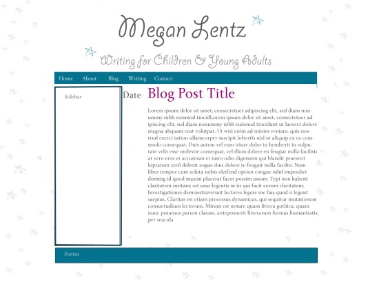
This Mock-up uses the blog as the home page. The stars and font add a playful, whimsical element to the website.
Mock-up 2
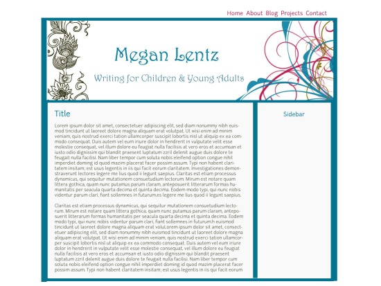
The second Mock-up aims for a more professional, but still fun feel. The colors are a bit more serious and the graphics are a bit more mature.


Pingback: November Roundup